Polar Opposites
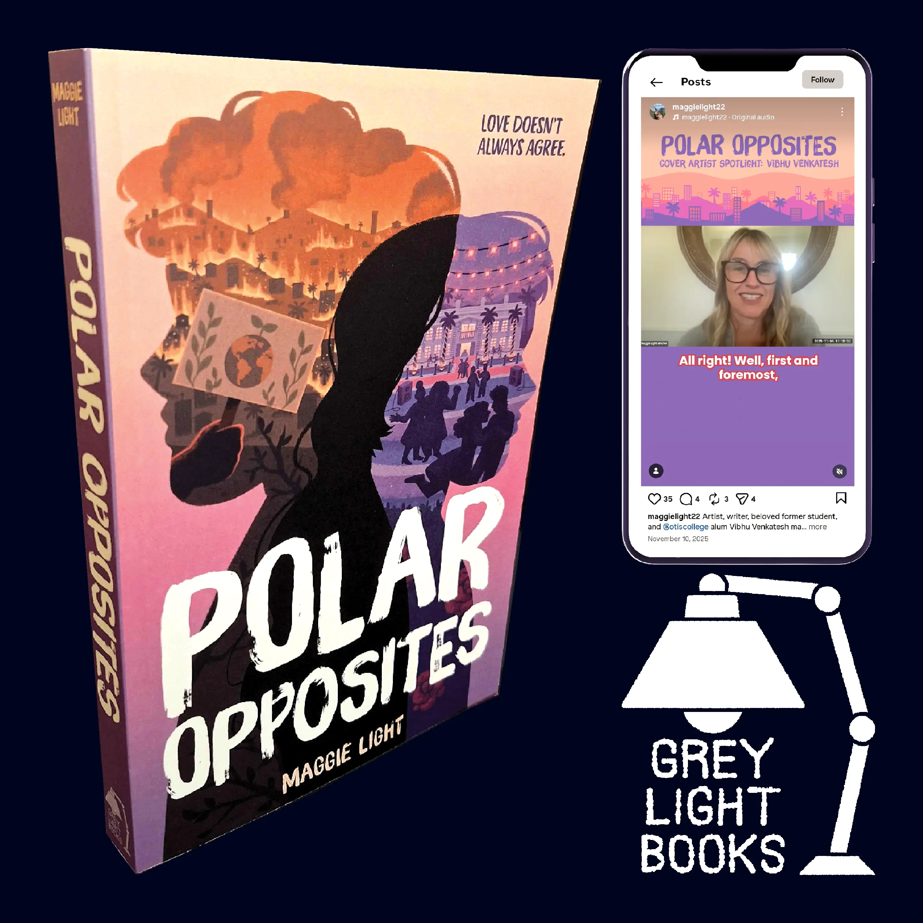
Book cover design, publisher logo, and promotional video for Maggie Light's 2025 novel Polar Opposites, a cli-fi romance following two young people in the aftermath of a wildfire.
SKILLS: Book Cover Design, Illustration, Logo Design, Social Media Content Creation, Typography, Visual Identity
SOFTWARE: Adobe Illustrator, Adobe Premiere Pro, Paint Tool SAI
YEAR: 2025
Book Cover
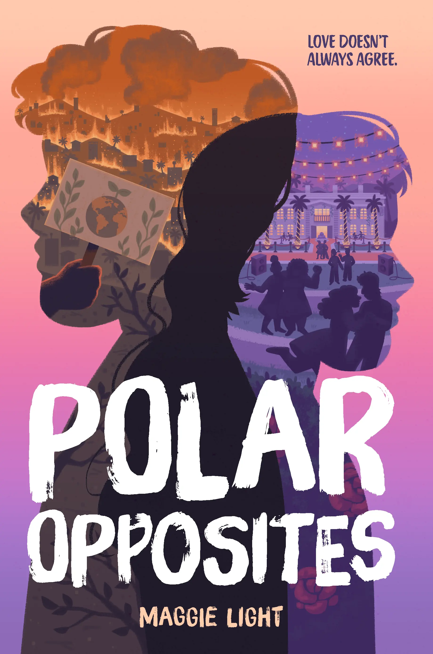
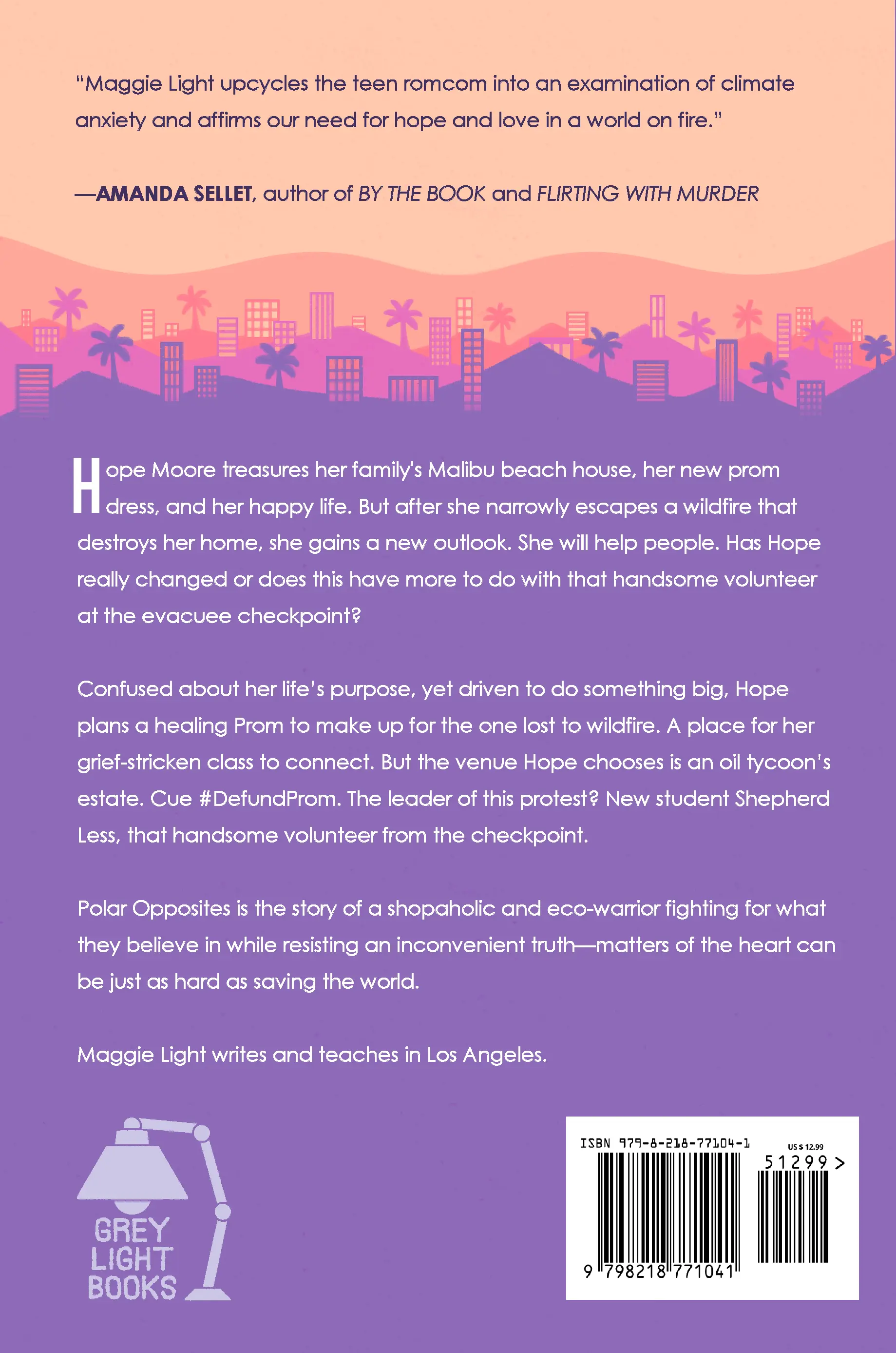
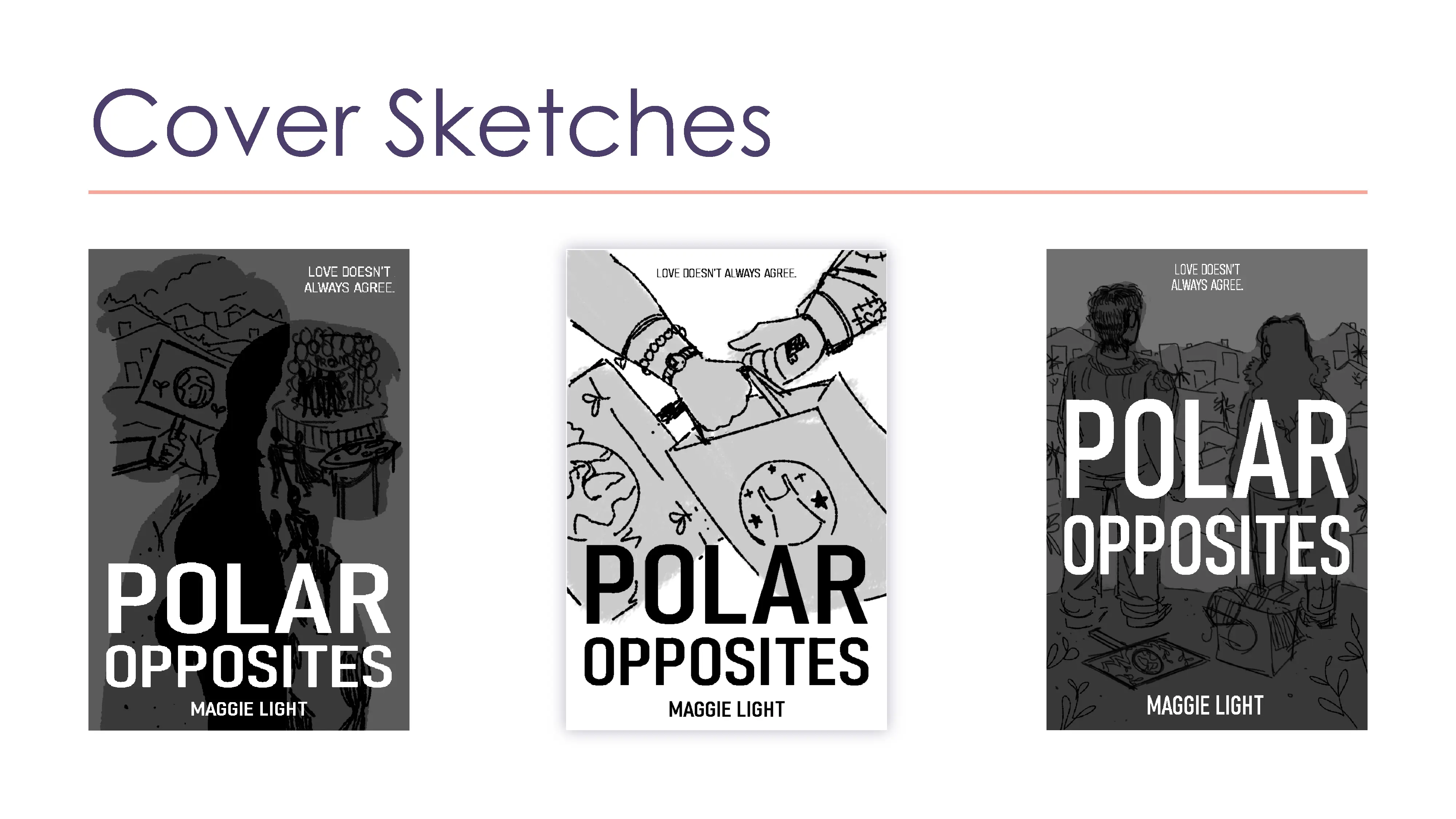
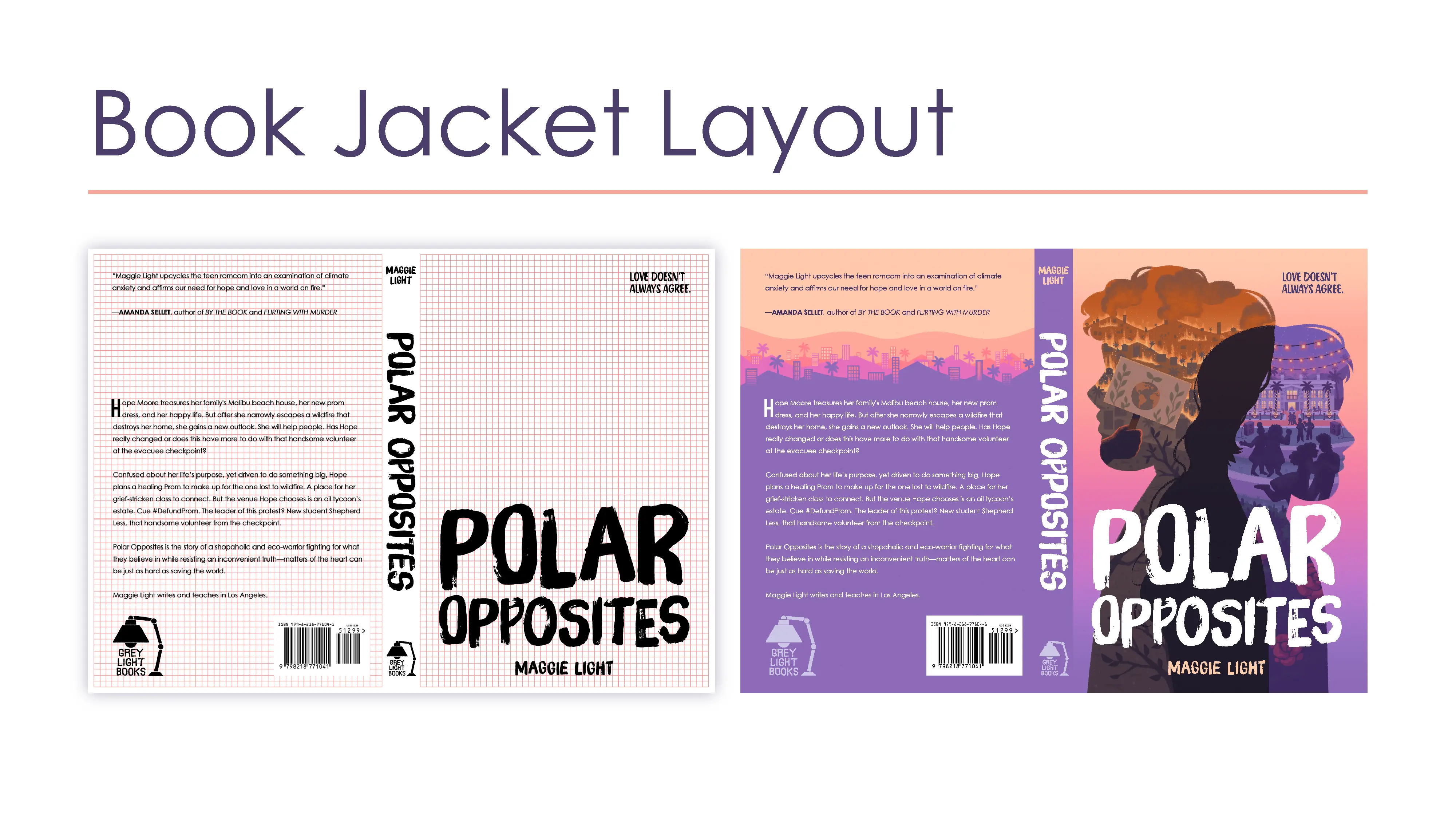
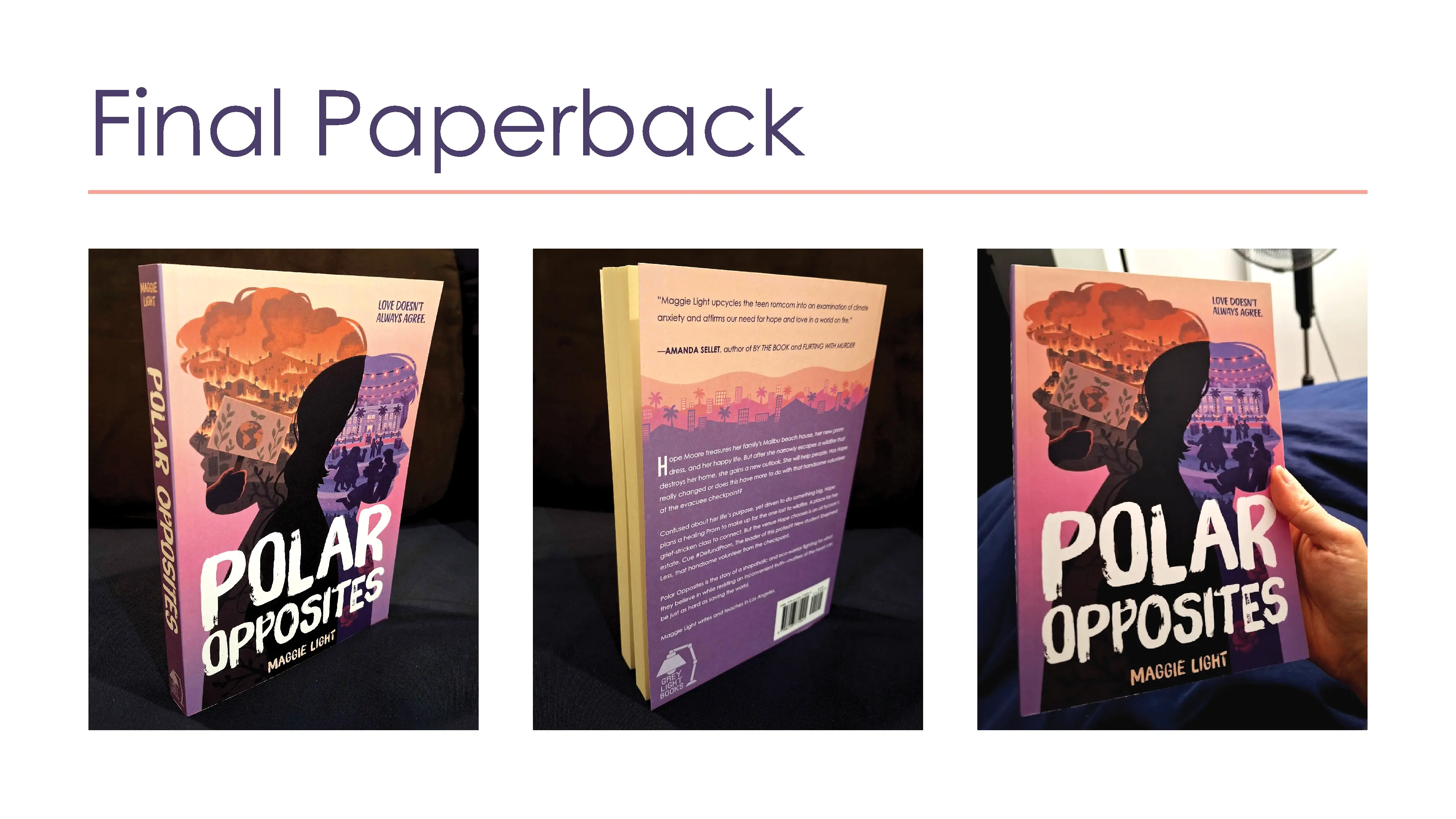
The 6" x 9" paperback and e-book cover for Polar Opposites.
The Venn Diagram of the two protagonists' silhouettes represents how they clash in their different approaches to community aid, but also how they overlap in their shared goal of helping others.
The story is set in Los Angeles and Malibu, so I included imagery of palm trees, hills, and skyscrapers on the back cover for a Southern California feel.
Promotional Reel
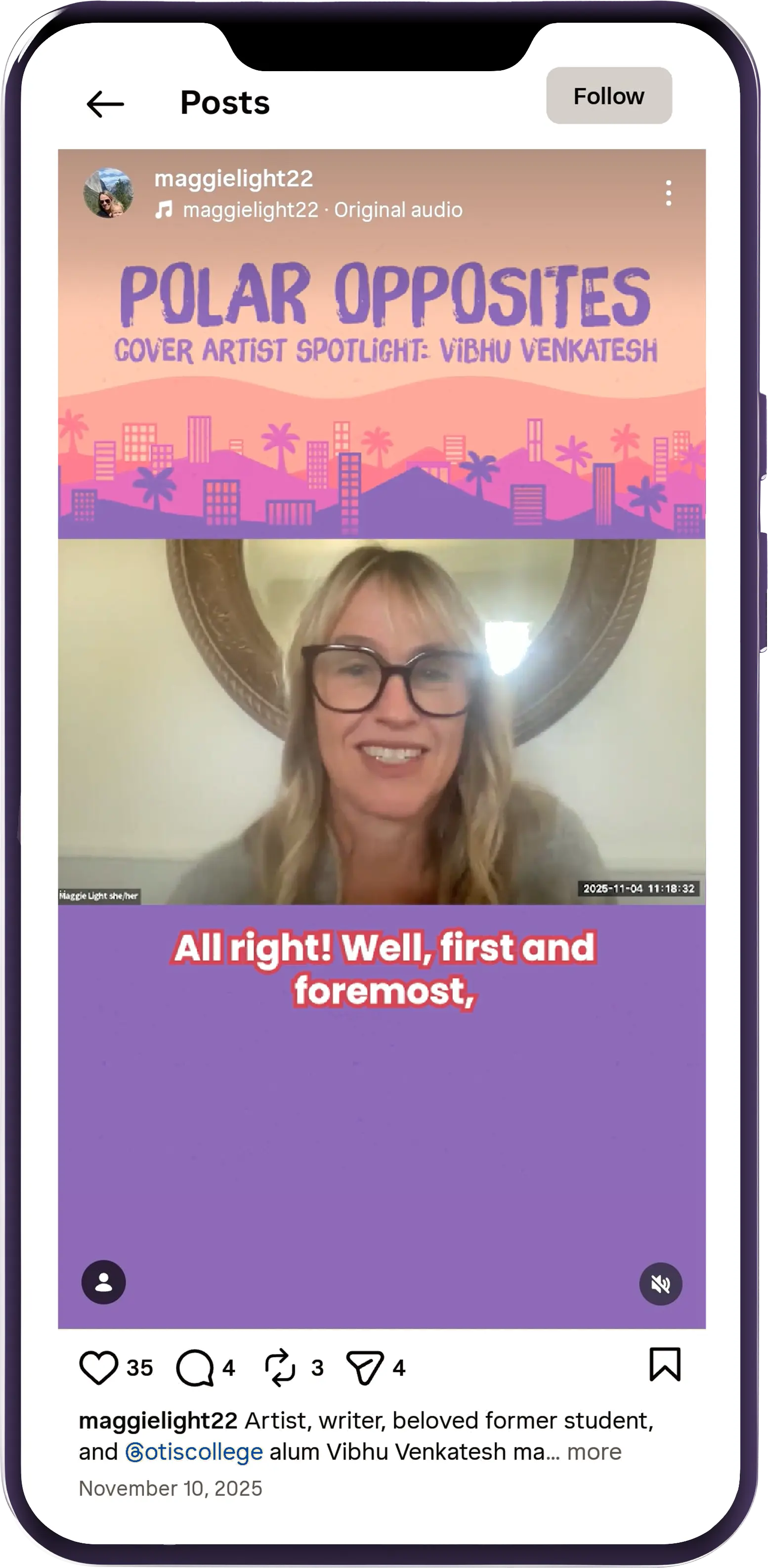
As part of the author's strategy to promote the book to her Instagram followers, I edited and captioned footage from our Zoom interview to fit Instagram Reel dimensions.
View the posted reel at the following link: Polar Opposites Cover Artist Spotlight.
Visual Identity
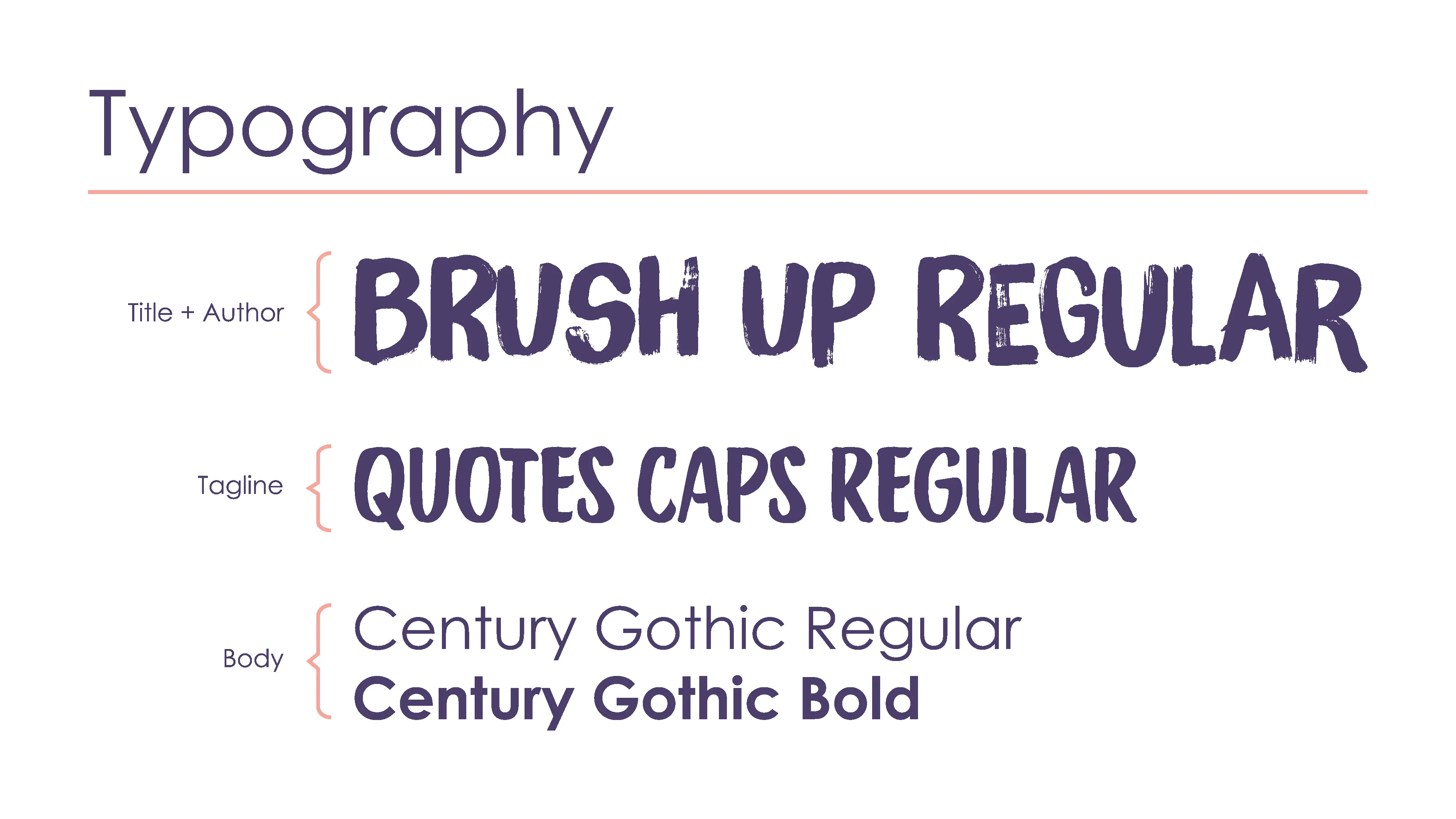
I selected handwritten typefaces for the title and tagline. The title typography is slightly worn-away, as I wanted to also represent the book's topics of natural disaster trauma and recovery.
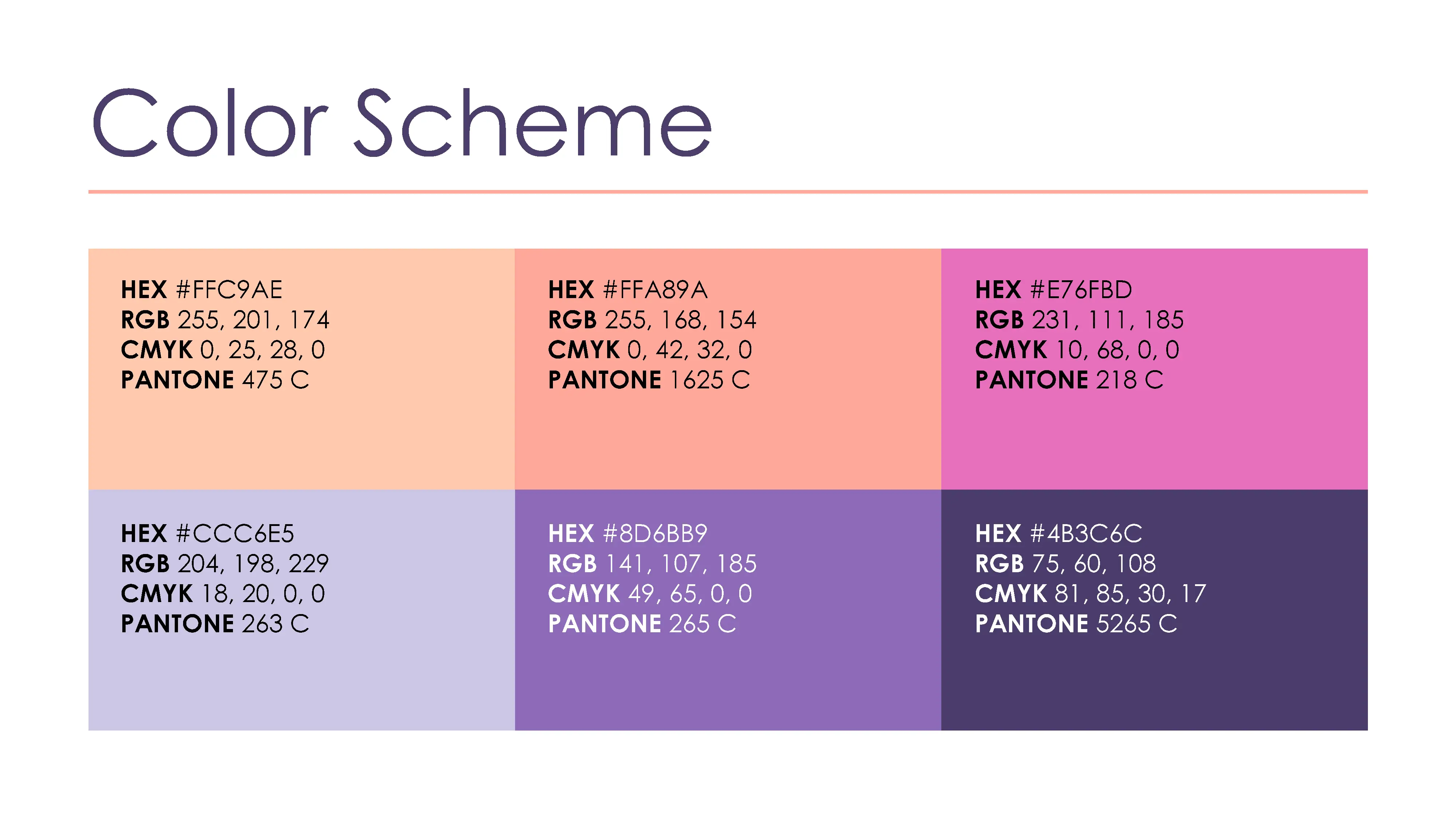
As for the color scheme, I chose bright oranges, pinks, and purples to match the visual style of YA rom-com book covers.
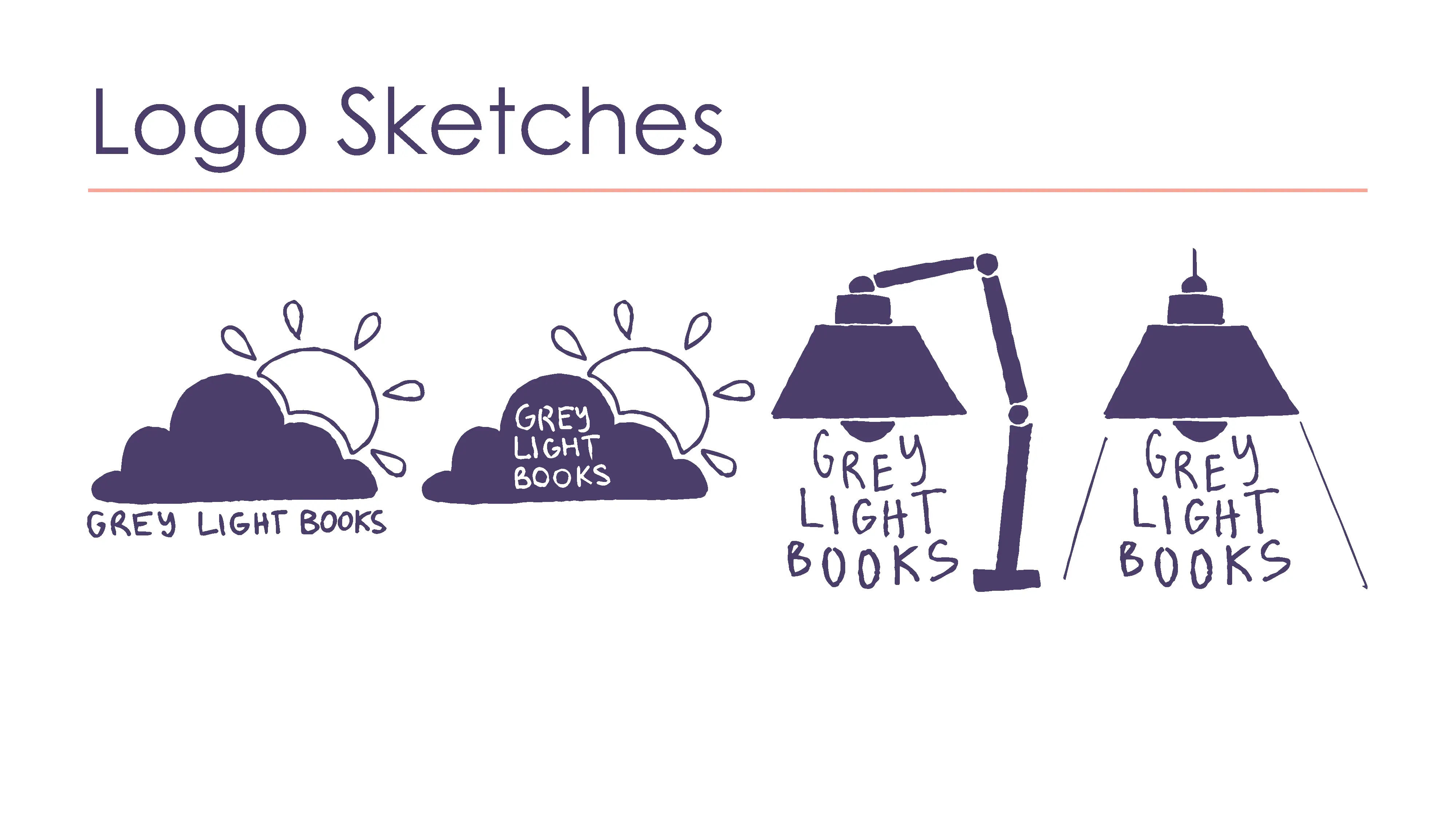
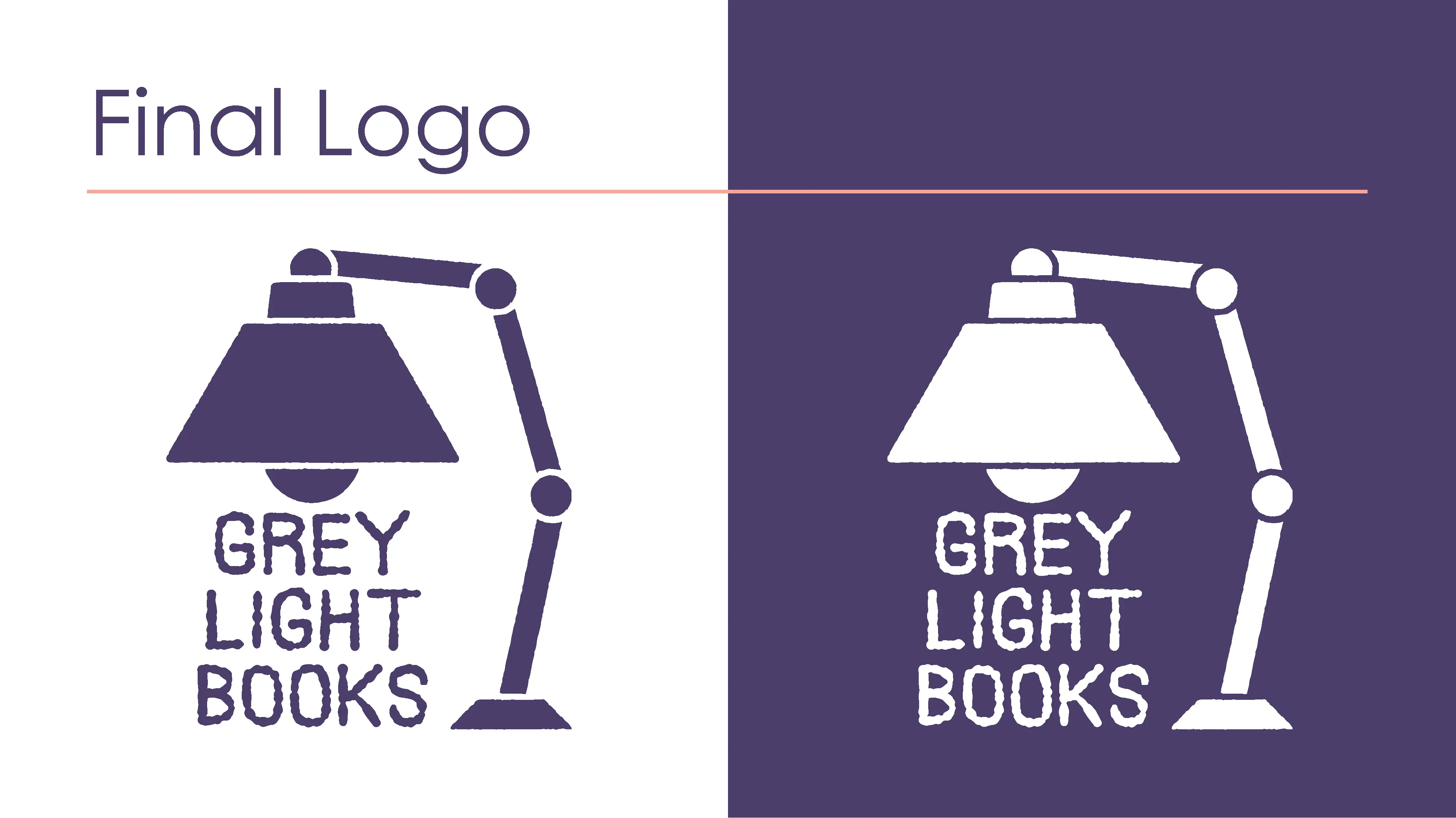
The Grey Light Books logo is inspired by a reading lamp, incorporating the theme of "light" in the publisher name and the author's name.
